Hey, guys! For today's post, I will be sharing about my thoughts and experiences regarding the Colourpop Sage The Day Eyeshadow Palette. I didn't have a great experience with my first ever palette from the brand, The Zodiac Palette, as the mattes were dry and the shimmers were lackluster. I didn't buy anything from the brand since then and I wasn't really motivated to buy anything from the released collections. I always thought the brand is duping themselves by releasing similar palettes just in different aesthetic and packaging.
 |
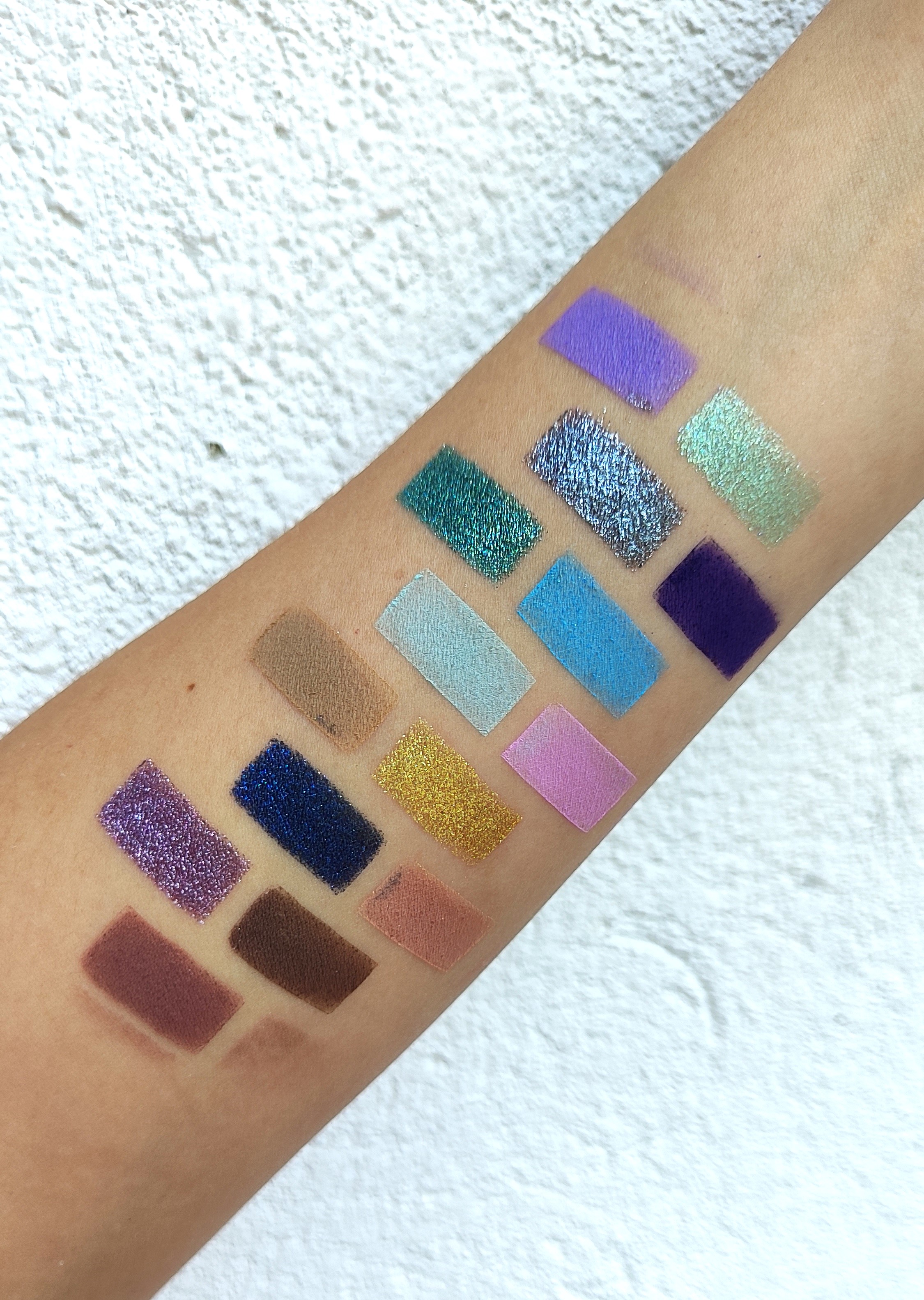
| Click the picture for a clear view |
As I was browsing the internet for new eyeshadow palettes to play with, I have thought of trying newer eyeshadow palettes from the brand. This palette and the Darth Vader are the ones that caught my eyes the most and so I bought both. 5 years after trying anything new from the brand, I can definitely say the formula of the shimmers have improved a lot. This palette is similar to the The Child palette but I love the shadows here more especially the matte browns they have included that's why I chose this one. I love that I can create smokey looks; making this palette perfect for day to night green eyeshadow palette.
 | |
|
I love that they included a couple of duo chromes in here with smooth shifting and that metallic moss green is everything and I think is the star of the show. The mattes are pigmented, feels a little rough to the touch but is still blendable, and buildable. I also like this is in a cardboard packaging and got no mirror which makes it easy and light to travel with.
Click the picture for a clear view Let's now talk about each shadow. Starting front the upper right shade:
- Lit Vibes (shimmer white gold with green reflex) - this is one of the shifty shades and perfect for the inner corners.
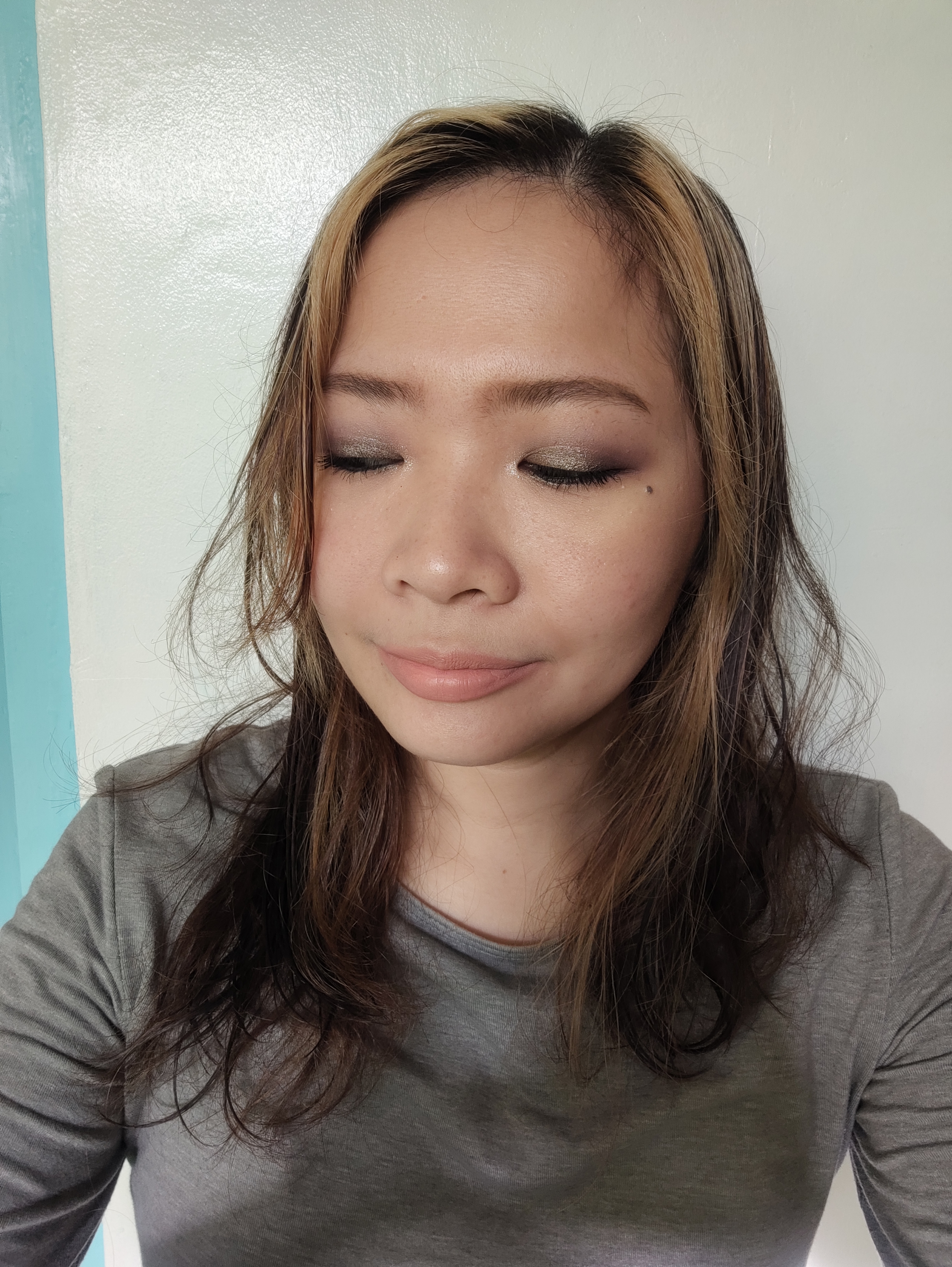
- Retreat Me (shimmer light green) - look cute all over the lids and gives this fresh vibes. I paired this Keep Calm on the crease and Intuition on the inner corner. It looked really light and fresh. See my Instagram post to see the look.

- Sips Tea (matte pale green) - haven't played around with this yet but I think it's a boring shade. I will trade for a matte dark green shade if I can. But I guess they put it here to blend soften the other matte green shade.

- Keep Calm (matte sage green) - I love this shadow! Looked so pretty on the crease and easy to build up. Doesn't look patchy and is blendable. I think this shadow all over the lids then topped with Retreat Me would make a cute green look.
- Tree Of Life (metallic moss green) - The star of the show! It feels so buttery and glides on smoothly on the lids. I love that this just feels like butter, no flakes or annoying glitters, just pure smoothness.
- Intuition (matte light brown) - Warm brown shade that is perfect as transition shade. This pairs really well with Nature Bae and Smudge Me. It is also blendable and buildable and really pigmented.
 | |
|
- Manifest (matte sparkle warm) - Caramel brown shade that I love blending on my crease or outer corner, depending on what look I am going for. This also really pigmented and blendable.
- Nature Bae (blue brown duo chrome) - This duo chrome can be found anywhere now a days but I still love that they have included this in the palette. It's perfect to pair with Manifest and Smudge Me. I love that this palette has brown options if you don't like wearing an all-green eyeshadow look.
- Smudge Me (matte brown) - I love this brown shade! It's the perfect brown - not warm, not cool that almost looks like black, just straight up brown. An essential shade that can be used as a liner, outer v shades and all over lid shade for that stunning smokey eyes. This is boring to some people but this an essential for me.
As I have said, I prefer this palette than The Child one because it has a balance of green and brown shades, giving more options to what look you are going for. The yummy chocolate brown mattes with the different shades of green are gorgeous combinations that give more variety. This might be my new favorite 9-pan eyeshadow palette from my collection and might be included to my Top 5 this year. Let's see about that on my upcoming eyeshadow palette ranking post. 😄
Do you also have this palette? Do you prefer this one or The Child palette? Please let us know and give us insights on your comparisons by leaving a comment. I hope you enjoyed this post and convinced you to buy this palette because it's affordable and will add gorgeous color story on your collection. Please have a nice and stay safe. See you on my next post. 💖


")