Hello! Who's excited for 2024? Definitely me! This year has been really tough with work and my overall mental health but the biggest plot twist I had this year was my decision to leave the work that I have loved for so many year. I realized that I wasn't passionate about it at all anymore and has become toxic. I know it was a big decision but its also equated to bravery since I value my health and myself more than my job. I can get another job but I can get another me. 💪 There are just some things that are not worth my time and I believe in myself that I can get another work that I will love, enjoy and be happy to devote my time with. 💖
 |
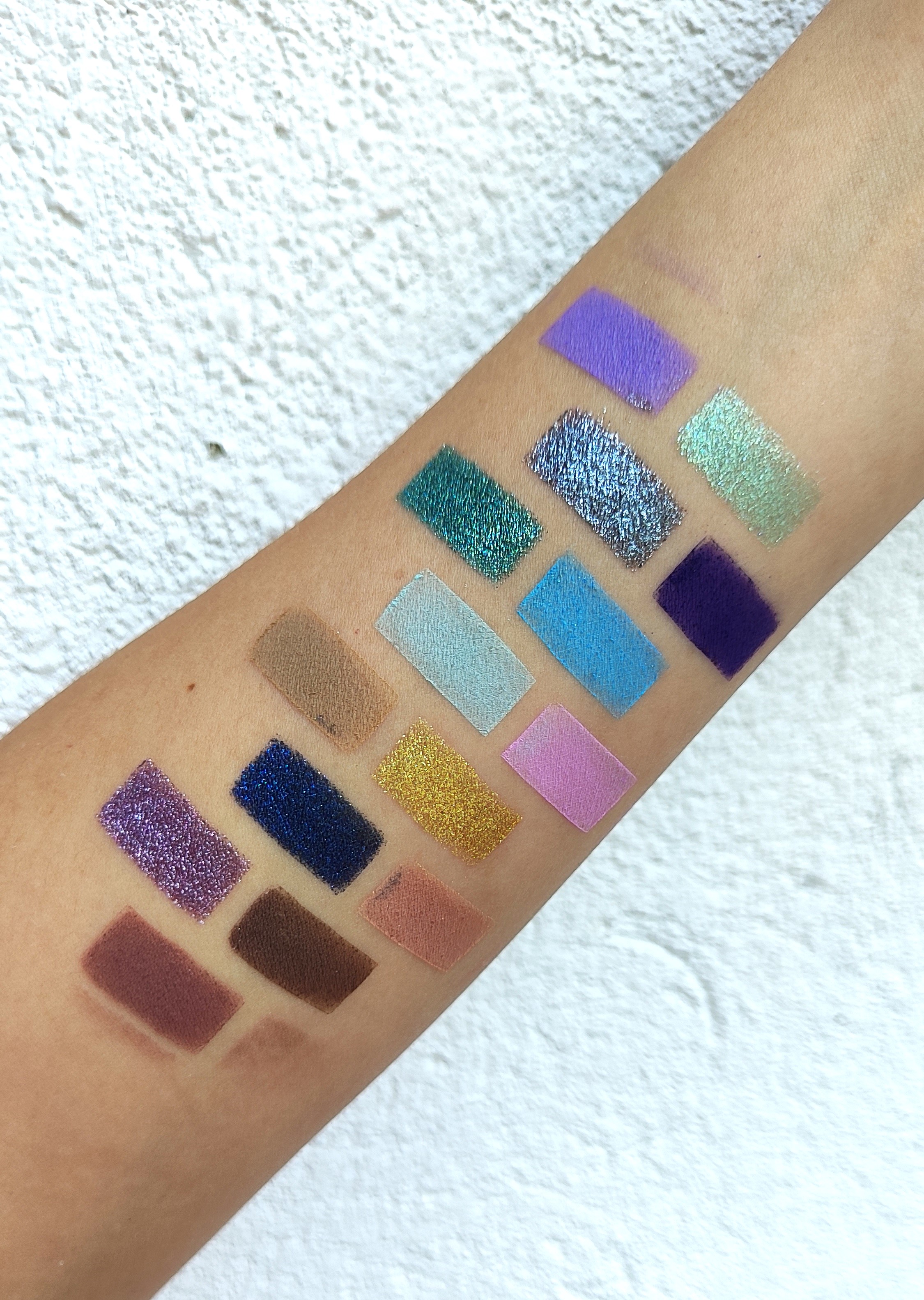
| Biya 9 Colors Eyeshadow Palette 102 |
To start with new beginnings, I have decided to join a different eyeshadow project pan that started by Sofie Alexandra called the Project Level Up. As per my understanding, this project is a mix between Pan Those Eyeshadows and Project No Pan Left Behind. This is a project where you basically pick a palette, whether through a random generator or you personally pick, use all of the eyeshadows then hit pan eyeshadows that corresponds to the current level you are in. For example, I am currently on Level 1 so I have to use all of the eyeshadow once then pick one shadow to pan on. If I have hit pan on my focus shadow, I can proceed to the next level and the same rules apply. Is it clear? 😅 Sofie explained the rules clearly and you can check her video (click the Project Level Up link) to see how this project works.
 |
| Click for a clear picture |
I have encoded to the Tiny Decisions application all of my eyeshadow palettes that I haven't hit pan on yet and randomly generated a palette that will be my entry for Level 1. The panning gods wanted me to focus on this Biya 9 Colors Eyeshadow Palette 102 which features cool-toned eyeshadows ranging from greens, greys and browns. This is one of my newest palettes and I haven't even used this upon rolling thin in into this project. I am thankful that I have a neutral palette to start this project with since I will also be doing Pan Those Eyeshadows for 2024 and the randomly selected eyeshadows are colorful. 🙈 Please stay tuned for the introduction post.

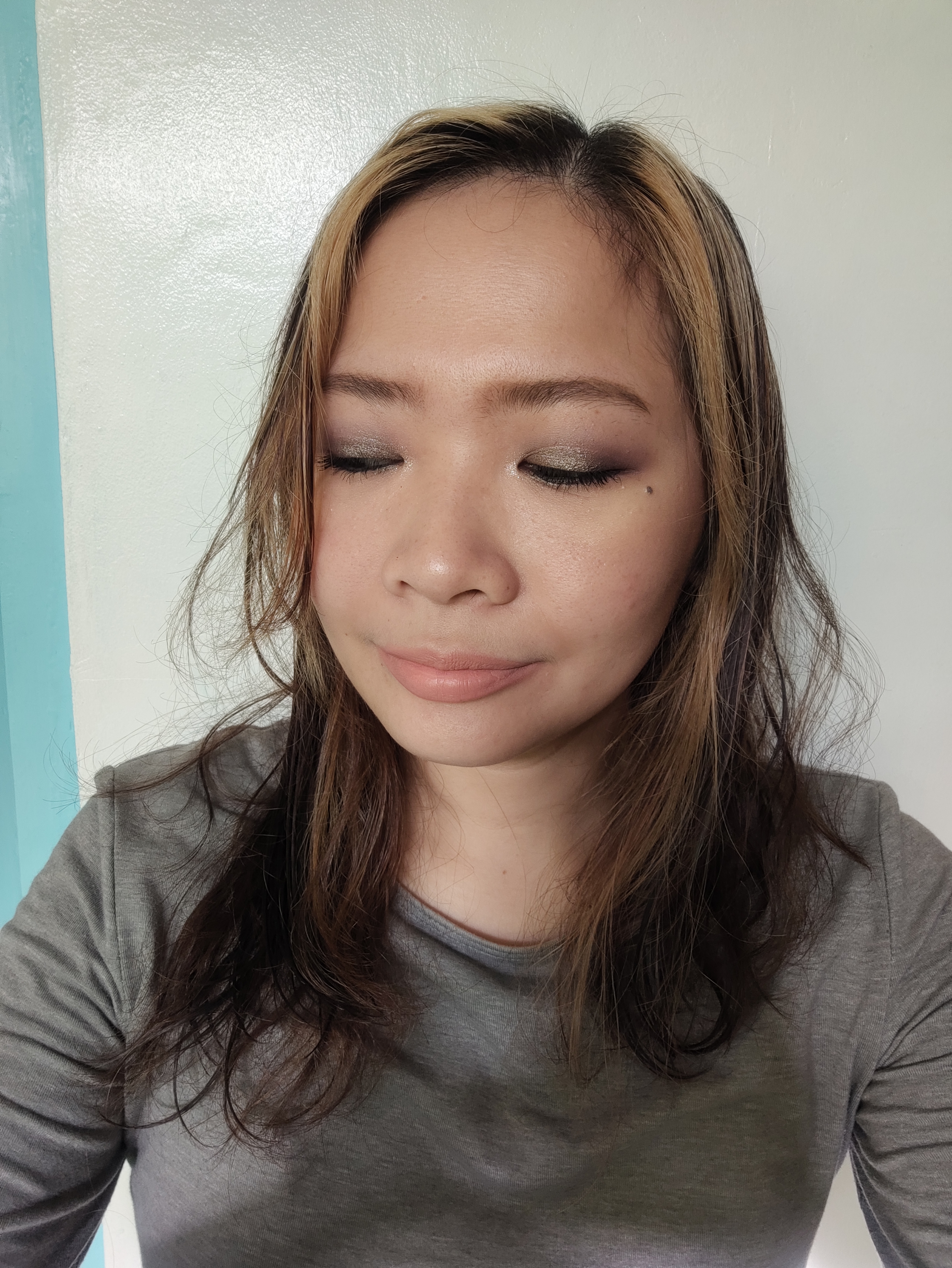
Upon posting this, I have already used all of the eyeshadows once and I have to say that the mattes are nothing special but they have standard formula and the blending is workable. The shimmers show up on my lids and stay long if used with an eyeshadow primer. I think I will focus on Shade No. 8 (grey sparkly shimmer) which you can see the dent I have made already. I use this on my inner lower lash line to give shimmery effects and I love the look. This has a putty consistency and I might hit pan on this pretty quickly. I hope I am not wrong!
I have also posted a a video on my YouTube featuring this palette to showcase the swatches of the eyeshadow. Yes, I started making Shorts and planning to expand Delightful Illusions to the platform. Please check the channel and I hope you subscribe and support me. 💖Anyway, I will be posting an update maybe on the end of January or anytime I am ready to proceed to the next level. Are you also doing this project? Please share with us your link on the comment section. Thank you so much for stopping by and please come back for more posts. Since I have a lot of time, I can now focus doing more blogs and shorts. See you on the next post. Have a nice day and stay safe. 💖


")