• Home
  • Reviews
    • Eyeshadow
    • Eyeliner
    • Foundation
    • Lipstick
    • Blush
    • Bronzer
    • Highlighter
    • Skincare
    • Hair
  • Project Pan
    • Pan Those Eyeshadows
    • Pan That Palette
    • Pan In Everything
    • Project Level Up
  • Style
    • OOTD
    • Accessories
    • Nail Art
  • Brands
    • Biya
    • COLOURPOP
    • Essence
    • Etude House
    • Ever Bilena
    • Focallure
    • IMAGIC
    • MOIRA
    • Perfect Diary
    • theBalm
    • UCANBE
    • Vice Cosmetics
    • ZEESEA
facebook twitter instagram instagram Email

Delightful Illusions


          Makeup and Astrology!? Oh yes, honey! So last year, KathleenLights release a Zodiac Collection with ColourPop and I was beyond excited to grab the palette the moment she have shown it to the world. I am obsessed with Astrology like her and I was freaking out when she released a palette that was planned out leniently to match the personality of each zodiac sign.  I was so determined to get the palette because I really really wanted to support my sister sign, she's Aquarius and I'm Leo, and astrology-themed makeup collections were popular in 2018. This palette was released in July, and I bought mine last year in September from Shopee because I didn't want to spend USD 50 just to get a free shipping. This retails for 18 USD and the seller sold this for PHP 1,100 which I think wasn't bad so I took the chance to buy the palette. Anyways, I have played with this palette sufficiently and I am now sharing my experiences, thoughts, and feelings with this makeup product. 

You can still buy this at Shopee
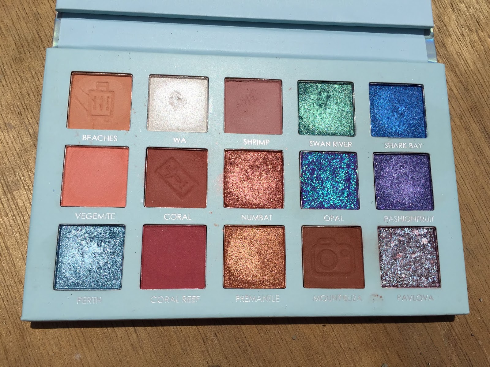
 PACKAGING     

    If you have noticed, the box is black and the packaging itself is navy blue. Isn't that so cute? I absolutely love how detailed the design of the packaging; they have paired the sister signs and they have spread out the stars like what you see on the sky. I also love that the packaging feels like velvet giving that luxurious vibe. The shade names are indicated at the back, the palette feels heavy and sturdy, and it has mirror. I have brought this palette with me several times whenever I am required to travel for work and no shadows were broken. This is so sleek and it fits on medium-sized makeup bag. 


          For those of you who are wondering, this brand is cruelty-free. This palette contains 12 pressed eyeshadow and each of them weighs 1 gram. This is a little bit less compared to their singles eyeshadows but are still on the same page in terms of quality (allegedly). My only complaint with this is that they didn't include the ingredient list on the box. I was curious about that so I went to their website and saw that they have a separate list of ingredients for each shadow and that would be too long to put in the box. I suggest that you should check the site before buying this palette because there might be some ingredients that your are allergic to. See this The Zodiac Palette page to see the ingredients. 

Look at that detail!
SHADES


          This palette is a mixture of matte, satin and metallic shadows. Upon looking at this the first time, you might be underwhelmed because it seems so not cohesive and no setting or inner corner shades. There are only 4 mattes in this palette and you might be wondering how many looks you can create with this palette? Is this even wearable for everyday use? Is the quality consistent throughout the palette? I will discuss to you each of the shade and what are my thoughts about them.

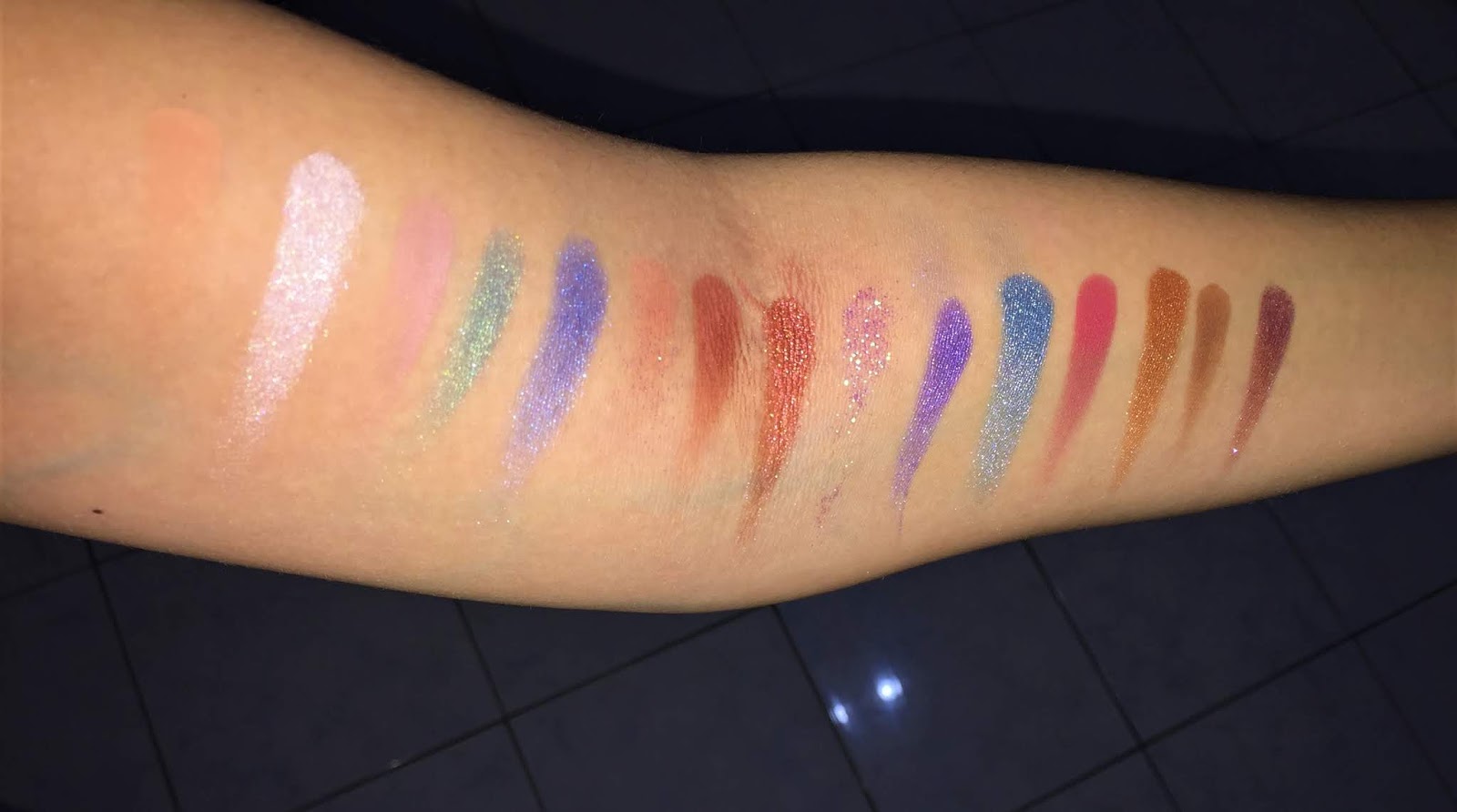
So pigmented yet so chalky!
   
Column 1: The Aries, The Sagittarius, The Leo

Fire Signs:


The Aries: This is driest among the shades and doesn't look metallic on the lids. This would've been better if they just made this into a matte fiery orange. They describe this as a "metallic firey orange" but I don't see the boldness. I tried using this one time to create a sunset eye look and it sucked. Please don't disrespect Aries people like that. :(

The Sagittarius: This is such a pigmented matte magenta purple but I can't take how loosely this shadow was pressed. I was just slightly dipping my shadow into this shade and it picks a lot of product! It's so messy and wasteful. I thought ColourPop eyeshadows are wonderful but why this particular shadow like this? :( Anyway, this so easy to blend and you only need a tiny bit of amount in order for the color to show up.

The Leo: Out of the fire signs, this is the only one I like it terms of formula. It glides on smoothly, it's very pigmented and the color is so unique. I have seen a lot of orange-gold metallic shadows but this one has a nice twist. They described this as a "soft coral with gold flip" and this looks so complementing to my brown eyes yet not overwhelming. If you love warm eyeshadow looks, you would love this shadow. 

Column 2: The Taurus, The Virgo, The Capricorn
Earth Signs:

The Taurus: This is the only matte transition shade in this palette but it is quite surprising that it goes well with all of the colors. You can definitely rely on this matte camel brown! This is such a pigmented shade for a transition color so you will need just a tiny bit of amount. You need to blend this fast because once it sets, it is kind of hard to blend. Work with this little by little since it  is pigmented. 

The Virgo: This matte chocolate brown is one of the most used shadows from this palette. I love using this as a crease shade paired with The Taurus on the transition area. Just like The Taurus, you only need a small about but this blends better than the other. I think you can pair the two together  and create a simple brown smokey look. Love these two!

The Capricorn: Ooh! This matte black with gold flecks look so classy on the pan, just like Capricorns! But, once you apply this on eyes, the gold glitters are disappearing. :( This such a pigmented shade, it's easy to apply, but the glitters doesn't stick. ColourPop, why? No, the glitters were not oversprayed, they are in fact existent throughout the pan. It's just that the glitters are flying away. I was rooting for this one to be shade from the palette! And why are all the earth signs matte? They aren't that dry and boring! :)


Column 3: The Gemini, The Libra, The Aquarius

Air Signs:


The Gemini: This is my favorite shadow out of them all! I love this metallic antique gold applied all over my lids. This kinda looks like a muted gold with green undertone and is definitely the most unique one in this palette. I love how smooth and buttery it feels whenever I touch it.  This is super pretty and if you want to buy this alone, you can now. Kathleen actually teamed up again with Colourop and they released the single version of each shade. How cool is that? Check it here.

The Libra: This is the other transition shade from the palette and it's in a satin finish. This is a satin dusty rose shade that pairs well with the purple and pink shadows in this palette. This is one of the most blendable shadows and I use this a lot as well. I am not really sure if this will translate on darker skin tones since it so light. I adjusted the lighting in this photo in order for you to see the shade well.

The Aquarius: This is the most disappointing shade among the shadows. Oh no, ColourPop. You did Aquarius wrong! This looks so pigmented in the swatch but so underwhelming once applied. It fades into a light blue shade once blended. I know this is supposed to be light because it is periwinkle shade but you need build this up in order for the color to show up. I was excited for this shadow but the formula disappointed. This one of the only 4 matte shadows from this palette and this one is a flop. Yikes! 

Column 4: The Cancer, The Scorpio, The Pisces
Water Signs:

The Cancer: This is the sweetest shade from this palette! Like The Gemini, this is also smooth and buttery when touched and glides on smoothly when applied. This looks like cotton candy and is so pretty on lids as well. This could be used to highlight the inner corners, I just don't think that it would pair well with the other shadows. Grab this in the single form because you won't be disappointed! 

The Scorpio: This metallic plum is so sexy. Yasss! All Scorpios are freaking sexy! This matches well with The Sagittarius shade to create that purple monochromatic look. I haven't used this that much but I really like the shade. No complaints at all! 

The Pisces: I admit, I was afraid to use this metallic aqua shade at first. My first thought was "How do I use this?" and how in the world will I incorporate this shadow on my everyday looks. This is not something that I would typically wear to work because it screams and is so loud. But, the first time I have laid this on my lids, I fell in love. It looks so pretty on the eyes! One time, I did a Palette Bingo and this one of the shadows that was generated. I had no choice but to put this on my lids since I can't put this on my inner corners. Oh my gosh! I loved it and I did use this on my lids twice. I know this is not wearable for everyday use but if you use The Taurus as transition shade, The Virgo on crease, this shadow on the lids and smoke it out with The Capricorn, it is perfect! I might do a tutorial for that look to see what I am talking about. :)


         Now that I am looking at the shades again, I coming up with different color combinations. I wanna play this palette more because I have been neglecting this lately. I have accumulated a lot of eyeshadow palettes this year and it is hard to focus on a single palette. Haha! Obviously, I have been working hard for this blog and I have been trying a lot of products so that I can share my thoughts and opinions with you. I really don't do tutorials since I am not professional makeup artist but I want to share some of the looks I created with this palette. Here some of the following:


       I tried to do a full matte eye look and I blended The Aquarius on my outer-V and it's not as vibrant as I wanted it to be. I think 3 layers would do. ColourPop, please re-formulate this shadow. :)


         This a smokey look that I created using The Taurus as transition shade, The Virgo on crease, and The Capricorn all over the lids. This one is so pretty but I had a hard time blending these three shadows well. I have to remove everything and start from scratch because it looked like a mess the first time I tried this look. Please use a light hand while using combing these three shadows because they are super pigmented and you don't need a lot. 


          This is the first look I created with this palette and this was way back last year December. I used The Taurus as transition shade, The Gemini all over the lids, and The Sagittarius on my outer-V. I apologize for the bad quality but it looks more vibrant and pigmented in person. Haha! :)

          Obviously, I am not a big fan of this palette but most the shadows are really beautiful and has a great quality. There are some flops but I think the greats ones empower the not so great shadows. I know a lot of people love the quality of ColourPop pressed eyeshadows, I was just not feeling some of the matte of this palette. The quality is not consistent throughout the palette but I think all of them are workable and your still getting the worth of your money. This is the most expensive palette in my collection and I am trying to explore this as much as I can. I wanna share or do a step by step post on how I create looks with this palette. As I have said, you can buy the shadows separately if you want to try some of the shadows only. You could save a lot of money if you buy the entire palette though.

          If you have any recommendations for a good ColourPop Palette please let me know because I want try the other ones. I am eyeing the Brown Sugar Palette because I want a neutral palette from their makeup line. Have you tried that one? What are your thoughts? Please share your thoughts and opinions with us. I hope you find this post helpful and I hope you enjoyed browsing this blog. I will talk to you soon. Have a nice day. Stay safe! XOXO

Share
Tweet
Pin
Share
No Comments

          Hey, guys! Do you like the new theme? I really love this! It's simple yet looks matured and blog is now easier to explore. I got this theme for free from Blogger Templates Gallery Anyway, for today's post, I will be talking about my newly purchased Vice Cosmetics Phenomenal Velvet Liquid Lip Kit in the shade Izkeravu. I was testing this new liquid lipstick from this brand for the past two weeks and I think I have already formed my thoughts and opinions on this new formula. Is it really phenomenal? Keep reading to find out. 
  
            If you are not aware, Vice Cosmetics is owned by our very own Vice Ganda which she launched last year. She started with liquid and bullet lipsticks, and now she has powder foundation, contour powders, blushers, highlighter, tints and brow products. I love how affordable her products are and she also sells bundles which you can save money from. I know i'm again late on the game with this lip kit, which she released last year December, but I am still reviewing this since I am curious and they hype has passed and you can rely that I my review is not influenced by others.


          First of all, I love how lenient this box is. The products are secured and protected from damage, although I really don't like the waste of materials in creating this box. They could've manufactured a smaller box, right? Save our planet! :) This lip kit contains 1 Velvet Liquid Lipstick (3 mL) and 1 Soft Glide Lip (0.25 g). I picked Izkeravu because this is only shade that I think I would wear on a regular basis; I bought this because it looked like a nude peach shade when I swatched this on Watsons. This kit retails for Php 295, but I got for Php 265 because there was 10% discount when I bought this.

The description and ingredients

          It's also nice that these products don't contain any parabens (cancer-causing ingredient) and that they included healthy ingredients that will nourish our lips. This new lip kit claims to be ultra soft, cloud-like, and hydrating. Are they really? Hmmmmmm. I have browsed their official store (Vice Cosmetics) on Shopee and these lip kits got 5 stars from their customers. As I have said, this is the only shade that I feel like I would wear since most of their lip shades are reds, purples, pinks. Their shades are screaming and loud, and I am neutral and nude kind of girl. I know that the target market is Filipino makeup lovers, which means that the products are formulated to suit Filipino skin tone, but I wish they would also create neutral and really nude shades. 


          I have also noticed there is slight change of color on their packaging. Their lipsticks used to have the fuchsia accent, and now it is hot pink. I have compared the packaging of this velvet liquid stick to the matte liquid lipstick (see my review of the Matte Liquid Lisptick in Kyemerut) and I realized that the matte one has this glossy packaging with the fuchsia accent while this velvet has this matte (glazed looking glass) packaging with the hot pink accent. Honestly, I prefer the latter because it looks bougie and can be compared to high-end lipsticks. Plus, the formula itself is really good.

Matte Liquid Lipstick vs. Velvet Liquid Lipstick

          Yup, you read that right. I am in love with this new formula. I love how smooth the lipstick feels on lips. This is the easiest liquid lipstick to apply on the lips, it's buildable, and doesn't look patchy when layered. This transfers on papers cups and mugs whenever I drink coffee upon arriving at the office, but the shade doesn't fade easily on the lips. Unlike the matte liquid lipstick, this velvet one doesn't smell like chocolate but it doesn't smell bad either. My lips feels so moisturized the entire day and  doesn't look thick when I re-apply this after eating my lunch.


The Izkeravu Soft Glide Lip Liner

          I have to say though, the lip liner doesn't glide on smoothly on my lips. I have read a review that this particular shade isn't really applying smoothly unlike the other shades. I don't what happened with this specific shade, maybe it has something to do with the manufacturing or ingredients? I have to use a lip balm in order for this to transfer on my lips properly. It is so hard to put on, like I have to really scratch this on my lips and I don't like doing that on my lips. I think that the lipstick would be fine on it's own. 

Izkeravu Velvet Liquid Lipstick on top of the lip lner

Perfect for daily neutral looks

          I have worn this lipstick the entire week two weeks ago. This went well with all the eye looks I created, even with the smokey ones. It says on the the site that this is a "warm nude shade" but it looks like a bright nude with orange undertone on my lips. I have also read from the reviews that this oxidizes into a shade darker on some people. On me, it looks almost bright light orange. I am not really used to this type of lipstick shade but I have loved ever since I have put this on my lips. I think this is now my favorite liquid lipstick formula. 


   Is this formula phenomenal? No, it isn't. It super comfortable though. Like heavenly and pleasurable type of feeling. Yes, it really is cloud like. It is pigment, 1 coat is enough to cover my entire lips. It doesn't fade easily even after sipping coffee or eating. It stays put for a very long time, and doesn't cake my lips even if I re-apply without wiping the first layer I have put on. I think I have to try other shades in order for me to form my solid opinion on the lip liners but I don't like this particular lip liner. 


          I still recommend the lipstick and it's one best that I have tried on the local market so far. Kudos to Vice and her team for this "Phenomenal" formula! I think that this shade will suit a lot of skin tones and majority of people can afford this kit. This is something that is worth spending your money on since this doesn't have any parabens, the brand is cruelty-free, and you are supporting the local market. You can get this on Watsons and online store like Shopee. If it is your first time shopping at Shopee, you can use my referral code "SYLDE22" to avail the Php 100 discount on your first purchase. Please note that I won't receive any money from this code, but I will be rewarded with Shopee Coins which I can use to avail discounts on my future purchases. :)

            This is for today's post and I hope you liked this one. I kept it simple and short since I don't want to bore you with my ramblings and I feeling direct right now. I will be celebrating my birthday this Wednesday and might share my birthday makeup and outfit. I'll see about that. :) Thank you so much for stopping by and I hope you'll follow this blog to keep you posted with my posts. Have a nice day. Stay safe. XOXO


Share
Tweet
Pin
Share
No Comments

        Hello, people of the world! I am so excited for today's post because I will sharing my thoughts and opinions regarding this newly release eyeshadow palette from Focallure called the Hi Perth. They have released 4 Go Travel Palettes last month and I have never ordered something so fast in my entire life. I kid you not, I placed my order 22 minutes after they have posted these palettes on their Official Shopee Philippines Store. They have been posting a lot of updates on their official Instagram account and I was so amazed the first time I have laid my eyes upon this specific palette. Thus, my immediate order for this stunning palette. 


        Upon receiving this palette, I was surprised that this palette is kinda small when compared to their 18-pan palettes. I realized then that the idea behind this palette is for it to be small, to fit in a makeup pouch, so you can carry it for travels without the burden of being to be too big. I was laughing to my self when I realized that because I didn't get the "Go Travel" idea the first time I encountered it. Well, I ain't complaining at all. This palette may be a little expensive but the quality of the overall packaging outdoes their previous ones. I mean look at this holographic packaging with the glittery title, they're cute! I was thinking maybe some of the cost went to the packaging since this is the first time they have put creative input into their packaging and I think that's a step up from the brand. It's still affordable! 


        I am really impressed with packaging and how they have provided extra protection by wrapping the palette with thick carton inside the actual box. I don't mind paying for the extra cost at all. I was even surprised that they have included a mirror and a plastic cover for the eyeshadows. The attention to details they have invested with this palette is incredible because I feel like we are paying for what we get for. Palette with inclusions like these cost higher and are not usually under Php 500. By the way, this only costs Php 498 and they are currently offering 10% discount if you buy 2 palettes. If it's your first time to shop at Shopee, use my referral code "SYLDE22" for additional Php 100 off on your total order. I am not earning any money from your purchase, instead I'll earn 50 Shopee Coins which I can use as discount for my future shopping.  Haha! I apologize for the little advertisement. :)


        The main reason why this particular palette was because of its color scheme; the blues and purples caught my eyes and captivated my heart. I have other eyeshadow palettes from this brand and I think these are new formulas for their eyeshadows. This palette feels ligther when I touch the eyeshadows and brush pick an of these easily. I gotta say these though, these are not the most pigmented I have seen from them but they are still high quality. I think these are subdued, buildable, softer version of their highly pigmented, in your face eyshadows. I don't want to dwell much on this topic since I am planning to compare the formulas across their various palettes and I don't want to spoil that too much. :) Anyway, I have reviewed their Tropical Vacation Eyeshadow Palette if your are wondering how that feels like compared to this palette. 


          I love how this palette comes with pressed multi-chrome glitter shadow and a purple-blue duo-chrome with brown base eyshadow. These two mentioned are definitely gorgeous eye toppers! I was stunned when I opened this palette last week, but I was even more amazed when I took a picture of this under the sunlight. Look at those screaming shimmers, metallic, and glitter shadows! I felt my saliva kinda dripped when I saw the picture. Haha! This palette was inspired by Perth, Australia where views of gorgeous coastal scenery can be found. I honestly did not have any idea where Perth was until somebody mentioned it on a video while I was watching a review of this palette. I'm really sorry if I offended anyone by that, I was just really clueless about the place. :) Anyway, basing from the pictures I saw from internet, the place is so gorgeous the palette depicts the place. :) I know that it's not yet Summer in Australia but you can pick up this palette and enjoy this during the sunny days. 

Even in the dark, these are still gorgeous.


        I was really careful not to destroy the symbols that was pressed with some of the shadows because I wanted you to seem them first. I have tested this palette 4 times already and I am so glad that they are still presentable for a blog post. I just don't like doing first impressions anymore because I want to test products at least a few times before I share my thoughts and opinions to the world. These eyeshadows are long lasting and they don't fade all through out the day with the help of my current eyeshadow primer. I use the Wet N' Wild Photofocus Eyshadow Primer and it's the best on I have tried yet. 


          My only complaint about this palette is that this doesn't any deeper shades that I can use to smoke out my outer-V and there isn't any cream shade that I can use to set my primer. I don't know if this palette was meant to be colorful and bright as possible since it doesn't contain anything for a night time look. I kinda wish that they have included a yellow shadow so I can also create a sunset inspired looks and that this can be called a semi-rainbow palette. Those are just my thoughts okay, it doesn't mean that I am not satisfied or anything. I still love the fact that this is made of sturdy cardboard and that easy to travel with. I can pair this with my neutral palettes in order to create various looks while I'm on a work travel or vacation.

Swatches under the sunlight
So pretttyyyyyy


With flash
          As I have head, these are subtle and subdued version of their highly pigmented eyeshadow formula. They feel smooth and buttery, easy to blend, buildable, and the brushes pick them up easily. Unlike the previous palettes I have tried from this brand, this the best when using brushes because they hold on tight to the bristles and they are easy to transfer on the eyes. It's like doing minimal effort for amazing impact. These eyeshadows are easy to manage, easy to apply, and light as air. I was having so much while testing these eyeshadows and I can't wait for other looks that I'm about to create. 

Look 1: Mint Chocolate


Transition: The Mail (light brown) -  Sleek Oh So Special Palette
Crease: Wrapped Up (taupe brown) - Sleek Oh So Special
Lid: Swan River (shimmery green)
Outer V: Coral (matte warm brown)
Lower Lash Line: Mount Eliza (chocolate brown) & Swan River (shimmery green)
Inner Corner: Wa (shimmery white)


Look No. 2: Blue Mermaid

Transition: Beaches (matte dark beige)
Crease: Vegemite (matte peach)
Lid: Perth (shimmery light blue)
Outer-V: Mount Eliza (chocolate brown)
Lower Lash Line: Mount Eliza (acted as a base), the topped with Shark Bay (shimmery blue) on the outer part and Perth (shimmery light blue) on the inner part
Inner Corner: Organza (shimmery light pink) - Sleek Oh So Special Palette


Look No. 3: Glittery Barbie


Transition: Shrimp (matte dusty mauve)
Crease &  Lower Lash Line: Mount Eliza (matte chocolate brown)
Lid: Pashionfruit (is that even a word???) (shimmery violet) 
Toppers: Opal (blue-purple-green pressed glitter) with Pavlova (blue-purple duochrome) on top
Inner Corner: Organza (shimmery light pink) - Sleek Oh So Special Palette


         Those are the initial looks I created with this palette. The only shadow I have tested out is the Coral Reef and might dig up on this soon. I'm not really a fan of dramatic warm looks since I'm smokey cool-toned eyeshadow look kind of gal. Thought I am genuinely happy that I played with this palette it made me went out of my comfort zone. I have gotten compliments on the three looks that I wore and my favorite was the second one. That shimmery light blue shadow was the most stunning color I have paired with my brown eyes with! Can you imagine working for the government and wear colorful eyeshadow looks majority of the week? Haha! I can't even. I was wearing glasses so maybe those weren't so glaring to the eyes of my superiors. Haha!

          I hope you find this post helpful if you want to buy the palette or having second thoughts if you want to try this. I recommend this palette if your are collecting colorful eyeshadow palettes or just want to see for yourself the new formula of Focallure eyeshadows. The quality, ease of use, and pigmentation are there and this is amazingly affordable eyeshadow palette. I can't stress enough how much this palette is worth every penny that you pay but I say that you snatch this if you have a chance. :)

          Thank you so much for stopping by. This is the first time I have posted on a newly release product and I am so proud of myself for doing a review immediately. I have plans for my next posts to come. Please stay tuned for that. This is it for this week and I will talk to you soon. Have a nice day. Stay safe!


Share
Tweet
Pin
Share
2 Comments


          Hey, guys! How's everybody? I've been work, as usual, and didn't have any spare time to do makeup tutorials. It's been two months since I have updated you with my Pan That Palette Challenge, but I have posting a lot of updates on Instagram (@pansbysylden). This my second update and I can say I made a lot of progress for the past 6 months that I have consistently used this palette. For those of you who are wondering what palette is this, this is the Sleek Oh So Special Eyeshadow Palette. This is the oldest palette in my makeup collection that's why I have decided to pan this palette for 2019. I love this palette so much and I am not getting tired of this yet. If you are curious as to what this palette looks like now, just keep on reading. :)

April 24, 2019
           This is what the palette looked like since my last update. As you can see, I have hit pan on the majority of matte shades. I love matte shadows and I think I might finish the 3 brown shades on this quarter of the year.

June 30, 2019
          And this is what my palette looked like as of June 30. I have no new pans to show but I have made an enormous progress on all of the shadows. I am so close to finishing the cream shade and the light brown shade. I have been using one of the dark brown shadow on my brows and I can say that I like it because it is the right tone for my hair color. I have also managed to create dips on the dark purple and lavender shadows. I am so positive that I will hit pan on these shadows this month. I can feel it! :) I also love the coral shade as a crease shade because it gives a fiery vibe to boring eye looks and I am quite surprised that it pairs well with the blue gray shadow. I love how I can create various looks with this color scheme. I don't have any specific goal for next update since I am still going with flow and find that technique to be effective for this project. It's just like telling me to let my creative juices flow and enjoy challenge. 


      I have devised a tracking system on this challenge and it was been really helpful to keep a watch on my progress. Since my last update, I have used this palette 40 times. I am quite proud of my self because I was consistently using this palette and I have paired this with other palettes in order for the monotonous routine not to be boring. For more specificity, I have used cream 33 times, shimmery pink 23 times, matte baby pink 12 times, and lavender 16 times since my last update.  


       I have used coral 14 times, bronze 6 times, matte light brown 29 times, and matte dark brown 33 times since last update. 


      For the last quadrant, I have used shimmery blue grey 6 times, dark purple 14 times, taupe brown 20 times, and black 7 times since my last update. I really don't give much attention to this blue grey shadows yet since I really don't like this as a lid shade. I am trying to find ways on how to utilize this shade more and this might be the last shadow that I hit pan on this challenge. I might grab matte grey shadows  from other palettes to pair with this shadow. I am hoping to have new pans by the next update since the 2nd quarter of the year has come and I haven't finish any shadow yet. Good luck to us!


         To spice things up a little bit, I have decided to merge this challenge with a different challenge called the Pan Those Eyeshadows. It is basically a challenge where you pick random eyeshadows and hit pan on them. After you have hit pan on a particular shadow, you can pull it out of the project and select another shadow that you haven't hit pan on yet. It is a roulette style and a lot of panners on the YouTube community does it. It is one way to force yourself to use shadows you might have been neglecting, or it could be a way to create color combinations you might not normally combine. It's a fun idea and I would like to inject it on my Pan That Palette so I won't get bored easily of my project. 


        I used a random generator to pick two shadows that I will include in this project. I have typed the shade names on Excel all of my shadows and all of them have a designated specific number. The generator drawn numbers 14 and 45. Number 14 on my list is this Caramel shade from I Heart Makeup Semi-Sweet Eyeshadow Palette. It is a muted gold shadow that I think would incorpate well with the bronze and brown shadows from the Oh So Special Palette. This is a lid shade and I think I might not hit pan on this any time soon. I'll  try to use this on my inner corners and mix with other shadows on my lower lash line. 


        The last shadow I have drawn is this satin white shadow which is number 45 on my list. This shadow is from the Essence All About Chocolates Palette. To be honest, I am also not sure if I can hit pan on this shadow soon since I have two base eyeshadows that I use to set my primer in the Oh So Special Palette. Haha! I feel so lucky! (laughing in a sarcastic tone) 


        That's my overall progress for this project. As I have said, I still love using this palette everyday and I am still enjoying this project. I might change the rules for my Pan Those Eyeshadows if I don't see any visible progress. Anyway, how are you doing with your Pan That Palette Challenge 2019? I hope you are doing great. If you have any tips or trick on how to do this project quickly, please share those on us by leaving a comment. I love sharing ideas and learning new things! Okay, this is it for now. I hope you are all doing great. I will talk to you soon. Thank you so much for stopping by. Stay safe. I love you all! :)

Share
Tweet
Pin
Share
No Comments
Newer Posts
Older Posts

Sylden Christine Hena

Sylden Christine Hena

Follow Delightful Illusions

My Socials

  • facebook
  • twitter
  • instagram
  • instagram
  • pinterest
  • youtube

Follow me on Instagram!

Popular Posts

  • 3 Ways To Use Calamansi (Calamondin)
                Calamansi , or Calamondi n (for other countries), is widely used in different fields. It's like a small version o...
  • First Impressions Review: Beauty Fix Peel-Off Mask Oil-Control and Detoxify (Taglish)
              Hi! Today, I'll be doing a First Impressions Review this Peel-Off Mask from Beauty Fix. I was browsing some beauty products a...
  • Glam Works Permanent Hair Dye + Routine
              I'm one those people who have had gray hair at a very young age. I inherited this condition from my dad's side. I remembe...

Affiliate

Recent Posts

Blog Archive

Contact Me

Name

Email *

Message *

Disclaimer

Some posts may contain affiliate links. I will get a commission each time you purchase through the link.

Visits

Created with by ThemeXpose | Free Blogger Templates