• Home
  • Reviews
    • Eyeshadow
    • Eyeliner
    • Foundation
    • Lipstick
    • Blush
    • Bronzer
    • Highlighter
    • Skincare
    • Hair
  • Project Pan
    • Pan Those Eyeshadows
    • Pan That Palette
    • Pan In Everything
    • Project Level Up
  • Style
    • OOTD
    • Accessories
    • Nail Art
  • Brands
    • Biya
    • COLOURPOP
    • Essence
    • Etude House
    • Ever Bilena
    • Focallure
    • IMAGIC
    • MOIRA
    • Perfect Diary
    • theBalm
    • UCANBE
    • Vice Cosmetics
    • ZEESEA
facebook twitter instagram instagram Email

Delightful Illusions


          Hey, guys! I am back with another eyeshadow palette review and for today's topic, we are gonna talk about the MOIRA Beauty Time To Shine Pressed Pigment Palette. This green is one of the palettes from their Celestial Series where there are 3 more palettes with distinct themes, but I loved this color story the moment saw this that's why I picked up this one. I have been buying a lot green eyeshadow palettes this year and you will definitely see those on the upcoming posts. 🙈


          What I love about this brand is that they put so much detail and attention on ever part of their packaging. The overall presentation of each palette they release is just incredibly detailed and stunning. This my second palette from the brand and I must say their palette releases from this year has improved a lot especially on the shimmer department. Though this palette has still pretty shimmers and easy to work with. If you are interested on a more colorful palette with wet shimmers and metallic, please check my Magic Dream Pressed Pigment Palette review. 

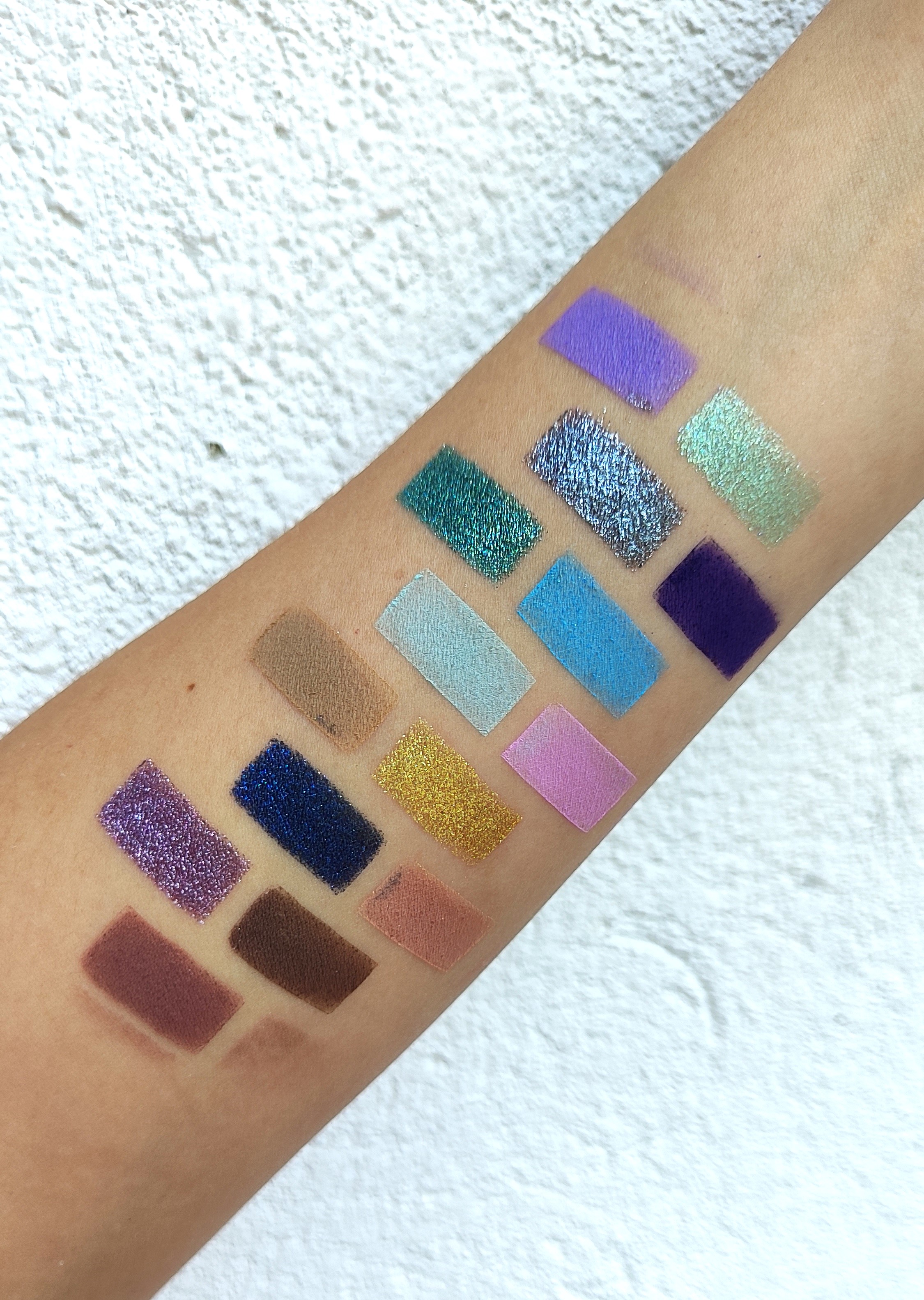
Please click the picture for a clearer view. :)

          I love that this palette contains neutral colors that are perfect for everyday work look but with pops of green eyeshadows. These green shadows are muted and can be built up for intense, smokey green look. The more I use this palette, the more I realized that this is versatile color story. I love how they included a random grey eyeshadow because I can create a cool-toned look, considering that this palette leans on the warmer side. 


         The matte feels like velvet and they are really easy to work with. They blend beautifully and I think that they have better formula than Colourpop. This brand is straightforward when it comes to creating their palettes -  none of that matte with glitters BS or pressed glitter eyeshadow that sometimes feel like a kid's makeup.😆 I don't know, maybe when it come with age, but for a 31-year old I'm not really fond of pressed glitters. Anyway, as I have said, Moira's matte eyeshadows are incredible and maybe one of the best one I have tried from affordable brands. When it comes to their shimmers, they have nice shine, glides on smoothly and not over the top. I have to admit, sometimes I just want a nice shimmer on the lid especially for work. The shimmers can be built up for intensity, though none of the these are sub-par.


          This palette has the perfect balance of shimmers and mattes which is also perfect for travel since I don't have to bring another palette to pair this with. They only thing I don't like about Moira palettes in general is that they are bulky. They take up a lot of space on my travel makeup bag. I get that they want to have aesthetically pleasing palettes, but can they make them travel friendly as well? 😅 


        This palette contains 15 eyeshadows and let's talk about each one. According to the packaging, there are 5 pressed pigments and 10 pressed eyeshadows included in this. Starting from the bottom left, these are the eyeshadows:

💟Limelight (PP) - matte beige pigment that is perfect for setting eyeshadow base or softening hard edges. 
💟Spiced (PP) - beige glitter topper that enhances the shimmer shades. It's really sheer and I'm pretty sure it's meant as a topper. It looks so sparkly on the lids and it's the only shade from this palette that has this kind of formula.
💟Carefree (PE) - matte olive green that make a perfect transition shade on green eyeshadow looks. 
💟It's Time (PE) - shimmer taupe which I used on my lids to create a smokey eyes. Gives such a lovely shine on the lids!
💟All Good (PP) - shimmer gold with green base which I haven't used in a look yet. This shade is really beautiful and I think if this paired with the green mattes, it will pop even more.


💟Dare (PE)  - matte warm brown that is essential for most neutral palettes that serves as a crease shade. I loved using this and I think it made my brown eyes pop. 
💟 Happy Soul (PE) - shimmer bronze that is just another essential on neutral palettes. I paired this with Dare and Tempting and it created this bronzy smokey look which I loved.
💟Just In Time (PP) - matte neutral brown that is perfect as a transition shade. 
💟Want (PE) - matte dark green shadow that is really pigmented. I made a green eyeshadow look and I just tapped my brush in this shadow and when I blended on my outer-v, the pigment was screaming. I just love how buildable this shade is.
💟Spotlight (PP) - matte reddish brown pigment which I haven't used yet also. I'm not really into reddish smokey looks but I think I can bear with this shade. 😅


💟Shine Bright (PE) - shimmer taupe brown shade that is more brown toned than It's Time. If it was me, I would exchange for a matte mauve shade instead of this. I think mauve transition shade pull of those reddish brown shades beautifully and would complement well with the green shades.
💟Tempting (PP) - matte dark brown pigment that is easy to blend and is essential in making smokey looks when using this palette. I always love a matte dark brown and I have hit pan a lot on the past.
💟At The Moment (PE) - matte light grey shadow that I didn't expect to show up on my lids. I used this as a transition shade on a cool toned smokey look that I created and I loved how pigmented it is. This has a neutral which made me fell in love with the shadow even more. I don't blue-toned grey shades since they look ashy.
💟Flash (PE) - shimmer lime green which I loved putting all over my lids. This shadow is so gorgeous and makes brown eyes pop. 
💟Signal (PE) - shimmer reddish brown which I haven't used yet. I might create a reddish brown eyeshadow look and post it on Instagram. 

Swatches on flash 


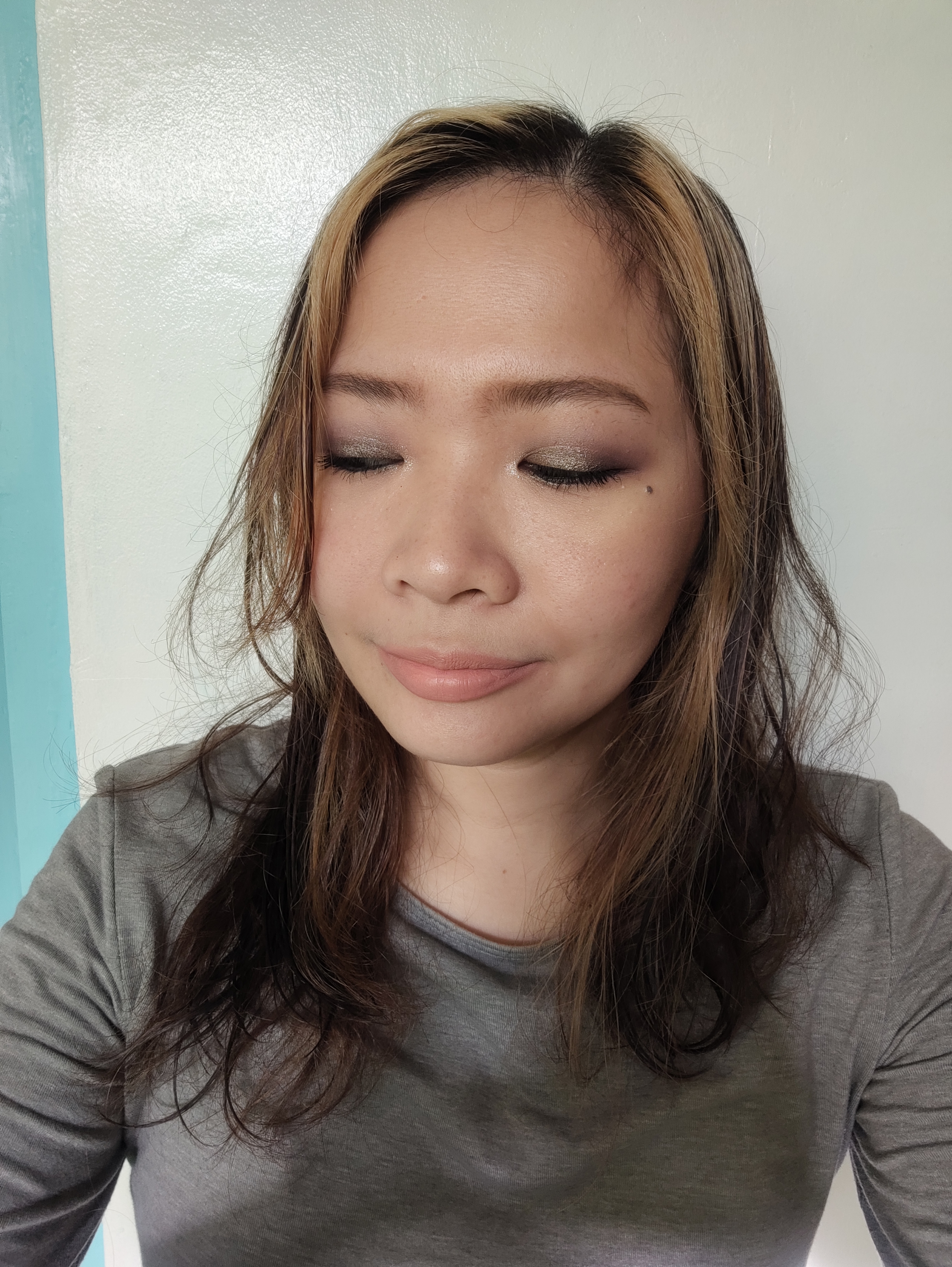
        The first look I created with this palette is a a grey-themed palette. I used At The Moment as transition shade, Tempting on the crease and outer-V, and It's Time all over the lids and inner lower lash line. I just used 3 shades and I was in love with the simple look I created. 


          Another look I created focused on the green eyeshadows. Just In Time as transition shade, Carefree on the crease, Want on the outer-v and lower lash line, and Flash all over the lids. I also used Spiced as topper shade to make the look pop. I really loved this green look. I have also made a neutral eyeshadow look but I didn't have the time to take a picture. Sorry, my bad. 😅

          Those are my thoughts on this palette and I would love to shoutout Jen Phelps for convincing me to try Moira Beauty. As I have said on my previous post, this brand is becoming one of my favorites since they make gorgeous eyeshadows and they straightforward on the direction of color story they are making. Plus, the attention to detail on every aspect but still maintaining an affordable price is unbeatable. I am so happy to try more indie brands since they are more worth the money than the mainstream brands. I am also happy to share a favorite online shop where I buy these indie makeup, See You Friday, they have great selection of brands I have never tried which they sell for reasonable prices. 

         I hope this post has been helpful and made you convince to try this underrated and slept on indie makeup brand. I am planning to buy another palette from them but I'll still have to decide what color story should I get. Anyway, thank you so much for stopping by and reading this post. Have a nice day and stay safe always. 

Share
Tweet
Pin
Share
No Comments


          Hey, everyone! Oh my gosh! It's been a long time since I posted here. This year has been pretty crazy. A lot of changes on my personal life and I have been travelling a lot for work. Despite being busy, I kept doing my Project Pans and buying so much makeup. You have no idea how much eyeshadow palettes I bought since the year start. Geez! I missed doing blogs and so I decided to start posting again. I hope I'll be consistent again. :)


        I have been eyeing some Moira Beauty eyeshadow palettes since last year and I finally got a chance to try a couple of them this year. My first purchase from the brand is the Magic Dreaming Eyeshadow Palette which came from their Moiraland Series. It's a carnival-themed collection consisting of two colorful pressed pigments palette. The palette that I got consists of blues, greens, purples and some neutral shades  leaning on the darker side which are perfect for me since I really love doing smokey eye looks. The other palette is more on pastel, bright and loud shades which is good since there are options for everyone. 

         Upon opening the packaging, there are are three Moiraland carnival tickets awaiting for you. The are so dedicated in making this collection feel like carnival-like, truly magical! There's a plastic protection sheet that covers the shadows with carnival-themed prints. The palette is bulky and heavy, which usually annoys me, but this one is not bothersome. I think this one could still be brought on travels without taking so much space. The mirror has the ticket print which I think is the for the aesthetic but still usable for doing eye looks. 


         The most unbelievable thing about this brand is their ability to create eye-catching designs and the attention to detail on packaging and palettes but still being sold for affordable prices. Like, how? This a US makeup brand but their products are being produced in China. Maybe that's the reason they are affordable? Anyway, upon receiving this palette, my jaw dropped because it feels heavy and luxurious. From the front, to the back, to all the sides of the box, everything has details and some are embossed.  The box alone feels like $10 for me. I'm never throwing away this packaging, I swear! But you would believe that this palette only costs $18.50? 

Please click the picture for a clearer view.

          This palette contains 10 pressed pigments and 5 pressed eyeshadows. As we know, pressed may caused staining on the eyelids but so far, I haven't experienced anything. I have no issues with these shadows and pigments. The mattes are pigmented, smooth, buildable and easy to blend. The shimmers have this cream to powder finish and some of them have this sparkly and glittery effect. They stay on the lids all throughout the day with a little creasing, but all is well with a good quality eyeshadow primer. Each shade has carnival-themed object pressed which is incredible since this costs a lot of money to produce. 


          This palette consists of colorful shades such as blues, greens, purples and some neutrals to balance the color story. So, let's talk about the each one of them.
  •  Midnight Fun (pressed pigment) - matte lavender shade perfect as transition shade or overall lid shade. A standard shade for creating blue/purple looks. I'm just impressed with the color pay-off.
  • Mood (pressed eyeshadow) - shimmer pastel mint green shade which is really gorgeous on the inner corners. I created a look with the neutral shades and this on the lower lash line and inner corners. A really nice accent shade. I would also love to pair this with the matte pastels. Let's see about that.
  • All Mine (pressed pigment) - metallic gunmetal shade that looks so wet. I haven't used this one yet but I would like to pair this with the brown shades to create smokey looks. (My favorite, of course.)
  • Fireworks (pressed pigment) - matte dark blue violet shade that is overly pigmented. I used this on my lower lash line as well and I was surprised on how vivid this shadow is. Easy to blend and isn't patchy. Be careful with using this one, you only need a small amount to created a vivid shade. I think this is one of my favorites from this palette.
  • Carnival (pressed eyeshadow) - metallic dark green shade that I am interested to use on the future. I think this pair well with the brown shadows as well. How I wish there is a middle tone or dark tone green shade on this palette so it can go with this shadow.

On natural light

  • Universal (pressed pigment) - matte sky blue shade that looks so pretty. How do I use this shade? I'm not really into pastel and bright shadows. But I bought this palette since I want to explore using bright eyeshadows. I hope I can incorporate this one on my future looks.
  • Ferris Wheel (pressed eyeshadow) - matte pastel green which I haven't used yet as well. Again, I don't do bright eyeshadows usually but I'm willing to try new things. 
  • It's Magical (pressed pigment) - matte pastel pink shade which I have used to blend with Fireworks. I love that they created a nice gradient and it toned down the vividness of dark violet shade.
  • It's A Date! (pressed eyeshadow) - matte light brown shade with yellow undertone. It's just your basic brown transition shade for warm and neutral skin tones. This buildable and blendable.
  • Sensational (pressed pigment) - metallic muted gold shade that I don't usually use but I think it would really go well with the blues, greens and browns.

Under the sun

  • Adventures (pressed pigment) - metallic dark denim blue with silver that looks sparkly in person. I haven't used this one yet but I think it would be perfect as accent color or eyeliner. I would also want to try this, making a smokey blue eyeshadow look.
  • Best Ever (pressed pigment) - matte beige with pink undertone. It's also a basic transition shade that would go well with the pastels, mauves and browns. I love this shade and I'm happy that this is included in the palette.
  • Dreamland (pressed pigment) - metallic violet shade that looks so wet on the lids. This shades compliments well my brown eyes and perfect to pair with the neutrals and other purples. This so sparkly in person and definitely my favorite from the palette.
  • Yay (pressed eyeshadow) - matte dark brown that is perfect to deepen eye looks. Just your basic dark brown shade but sometimes basic is all we need to complete looks. So blendable and buildable as well.
  • Joy (pressed pigment) - matte mid tone brown shade perfect for a crease shade. Again, just your neutral basic shade but transforms eye looks. This shade is lovely and goes well with the colorful shades.

On flash (the photographer do not know how to operate the camera, obviously)


         This palette is amazing and I haven't experienced any fallouts so far. Theses are hard-pressed, really pigmented and has balanced color combination. I also love that there is no light cream / beige shade because we already have like thousands of that from other palettes. This is a well-curated palette, creating day to night looks, ranging from light to dark shades. This palette is really inspiring for me since everytime I look at this, I create so many color combinations in my head that I want to execute on my looks soon. Overall, I recommend this palette if you want to try this brand as well. This brand is becoming immediately one of my favorites in terms of eyeshadow formulation, considering how affordable the palettes are. Shout out to my favorite shop from Shopee, See You Friday. This is where I bought this palette without paying for the shipping fee (from US). 

          I hope you enjoyed this post and convinced you to try this brand because their products are so underrated. I love supporting indie brands that deliver quality products that doesn't break my bank. I also purchased a green-themed palette from this brand which I feature soon. I hope you stay tuned for that. Thank you so much for stopping by. I will be back soon. Have a good day and stay safe. XOXO

Share
Tweet
Pin
Share
No Comments
Older Posts

Sylden Christine Hena

Sylden Christine Hena

Follow Delightful Illusions

My Socials

  • facebook
  • twitter
  • instagram
  • instagram
  • pinterest
  • youtube

Follow me on Instagram!

Popular Posts

  • 3 Ways To Use Calamansi (Calamondin)
                Calamansi , or Calamondi n (for other countries), is widely used in different fields. It's like a small version o...
  • First Impressions Review: Beauty Fix Peel-Off Mask Oil-Control and Detoxify (Taglish)
              Hi! Today, I'll be doing a First Impressions Review this Peel-Off Mask from Beauty Fix. I was browsing some beauty products a...
  • Glam Works Permanent Hair Dye + Routine
              I'm one those people who have had gray hair at a very young age. I inherited this condition from my dad's side. I remembe...

Affiliate

Recent Posts

Blog Archive

Contact Me

Name

Email *

Message *

Disclaimer

Some posts may contain affiliate links. I will get a commission each time you purchase through the link.

Visits

Created with by ThemeXpose | Free Blogger Templates